Accessibility profiles
A platform for everyone
Dyslexia? ADHD? Color vision deficiency? Or simply unique needs?
We understand that everyone experiences the world differently. That’s why our platform, as well as BBrainy, is designed to adapt to you. Whether it’s customizing fonts, colors, contrast, or other accessibility features, we make it simple to create a browsing experience that feels just right.
All it takes is a tap! Click the accessibility button in the bottom-right corner to explore profiles and adjustments tailored to your preferences.
How to use the section
- Select an accessibility profile: if you need comprehensive adjustments, choose the profile that best suits your needs.
- Manually customize: use content, text, color, and orientation adjustments to personalize your experience.
- Reset settings: click Reset settings to return to the default configuration.
This section is designed to ensure the site is inclusive and easily accessible to all users, regardless of their needs.
Accessibility Section Guide
Below, you'll find an explanation of each available option.
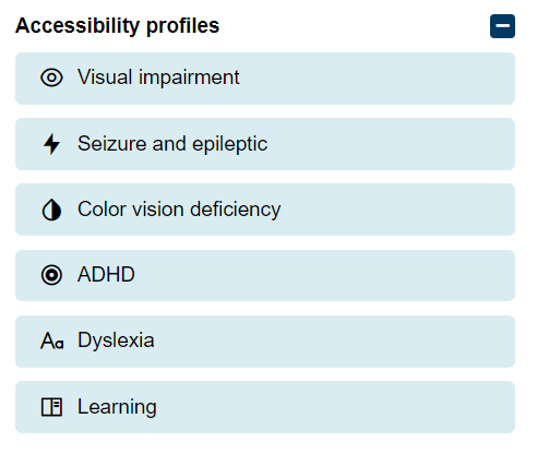
1. Accessibility Profiles
These profiles are predefined settings that apply adjustments to adapt the site to the user's specific needs.
- Visual impairment: improves readability for users with visual impairments
- Seizure and epileptic: reduces flashing or animated content to prevent epileptic seizures
- Color vision deficiency: optimizes colors for those who have difficulty distinguishing certain shades
- ADHD: adds visual elements to help focus attention
- Dyslexia: uses a specific font and improved spacing to facilitate reading
- Learning: supports students with learning difficulties through visual and interactive adjustments
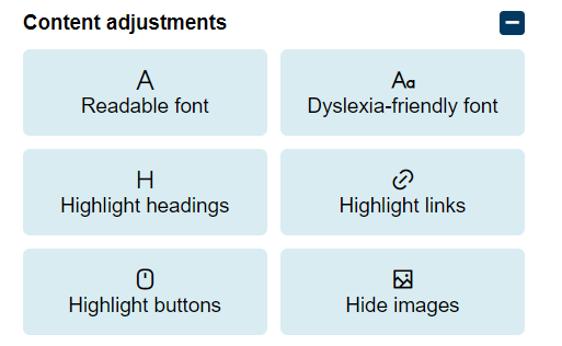
2. Content Adjustments
Allows customization of text and the visibility of elements for greater clarity.
- Readable font: changes the font to a more legible version.
- Dyslexia-friendly font: applies a font tailored for users with dyslexia.
- Highlight headings: highlights headings for easy identification.
- Highlight links: emphasizes hyperlinks.
- Highlight buttons: makes buttons more visible.
- Hide images: hides images to reduce distractions.
- Tooltips: adds text descriptions to buttons or interactive elements to improve understanding.
- Stop animations: stops animations on the site to avoid distractions or discomfort.
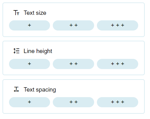
3. Text Size and Spacing
These controls allow you to adjust text presentation.
- Text size: changes the text size (+, ++, +++).
- Line height: increases the space between lines (+, ++, +++).
- Text spacing: adjusts the spacing between letters and words (+, ++, +++).
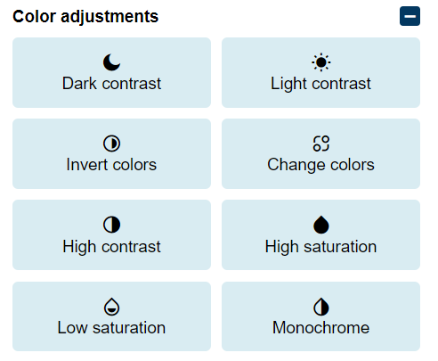
4. Color Adjustments
Modifies contrast and colors to improve visibility.
- Dark contrast: applies a dark background with light text.
- Light contrast: uses a light background with dark text.
- Invert colors: inverts the site’s colors.
- Change colors: allows customization of colors as needed.
- High contrast: increases contrast for better readability.
- High saturation: enhances color saturation.
- Low saturation: reduces color saturation to avoid visual fatigue.
- Monochrome: applies a monochromatic color scheme.
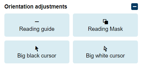
5. Orientation Adjustments
These tools help users focus and improve navigation.
- Reading guide: displays a visual guide to follow the text more easily.
- Reading mask: highlights one line at a time while masking the rest.
- Big black cursor: enlarges the black cursor for better visibility.
- Big white cursor: enlarges the white cursor for better visibility.

